Women's health information is everywhere, but most of it feels clinical, confusing, or wrapped in shame. From contraception to cervical screenings, the big health moments in women's lives deserve better than medical jargon or patronizing advice. Sundays Health set out to change that: creating a platform where women could get clear, no-BS health information that actually feels supportive. But to cut through the noise, they needed a brand as approachable and confident as the community they wanted to build.

Health communication defaults to two extremes: overly medical or awkwardly cutesy. Neither speaks to women navigating real questions about their bodies. The challenge wasn't just visual. It was tonal. How do you talk about contraception, periods, and reproductive health in a way that's informative without being preachy, friendly without being patronizing, and empowering without feeling like a wellness brand? Sundays Health needed an identity that could hold space for the serious and the playful, the awkward and the assured, all at once.

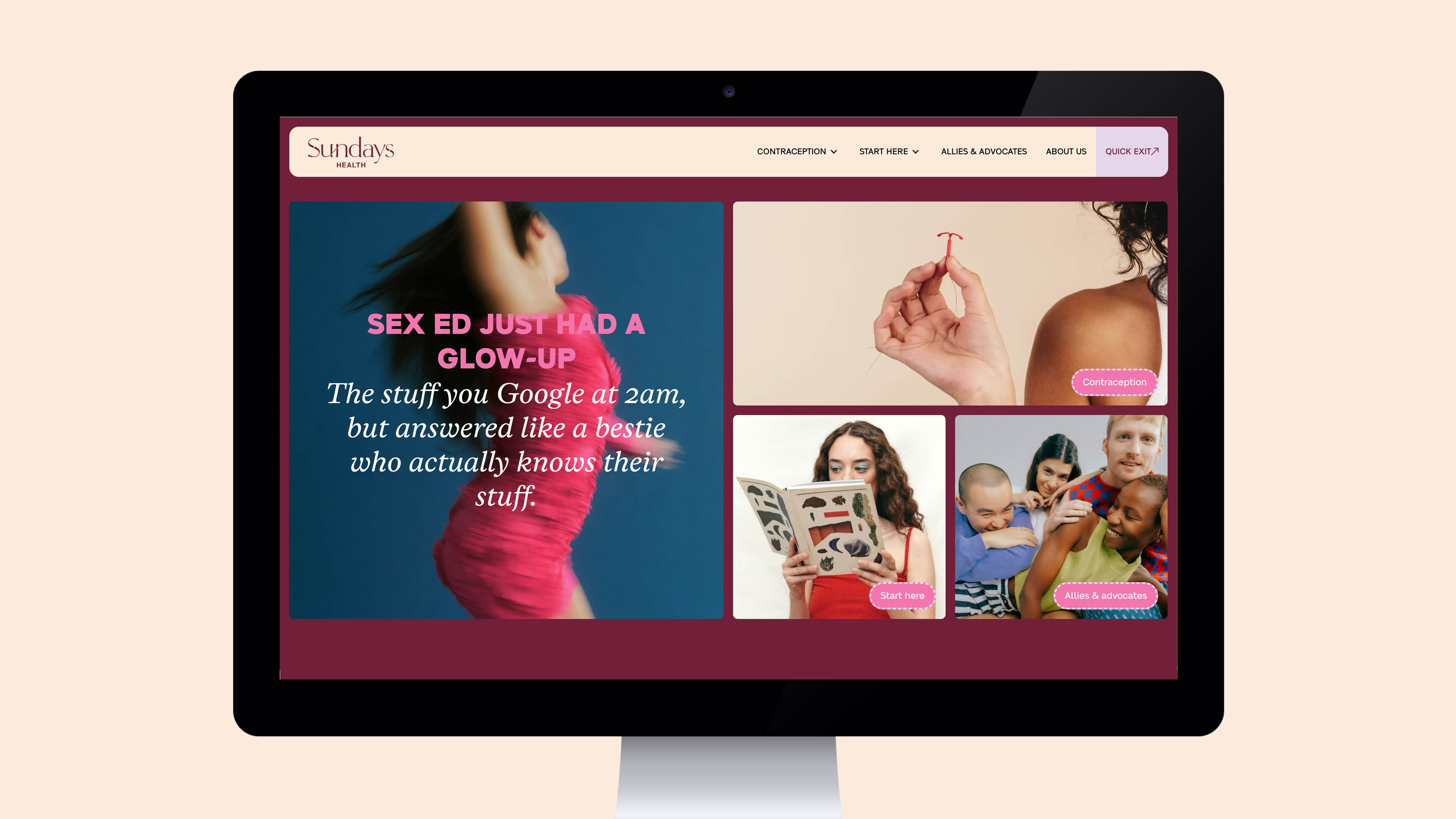
We developed a brand platform built around a simple truth: women's health should feel like Sunday morning. Easy, calm, and judgment-free. The brand positioning centers on three pillars: clarity, empowerment, and community. The tone of voice became the brand's secret weapon: casual, supportive, slightly cheeky, like your smartest, most no-nonsense friend.
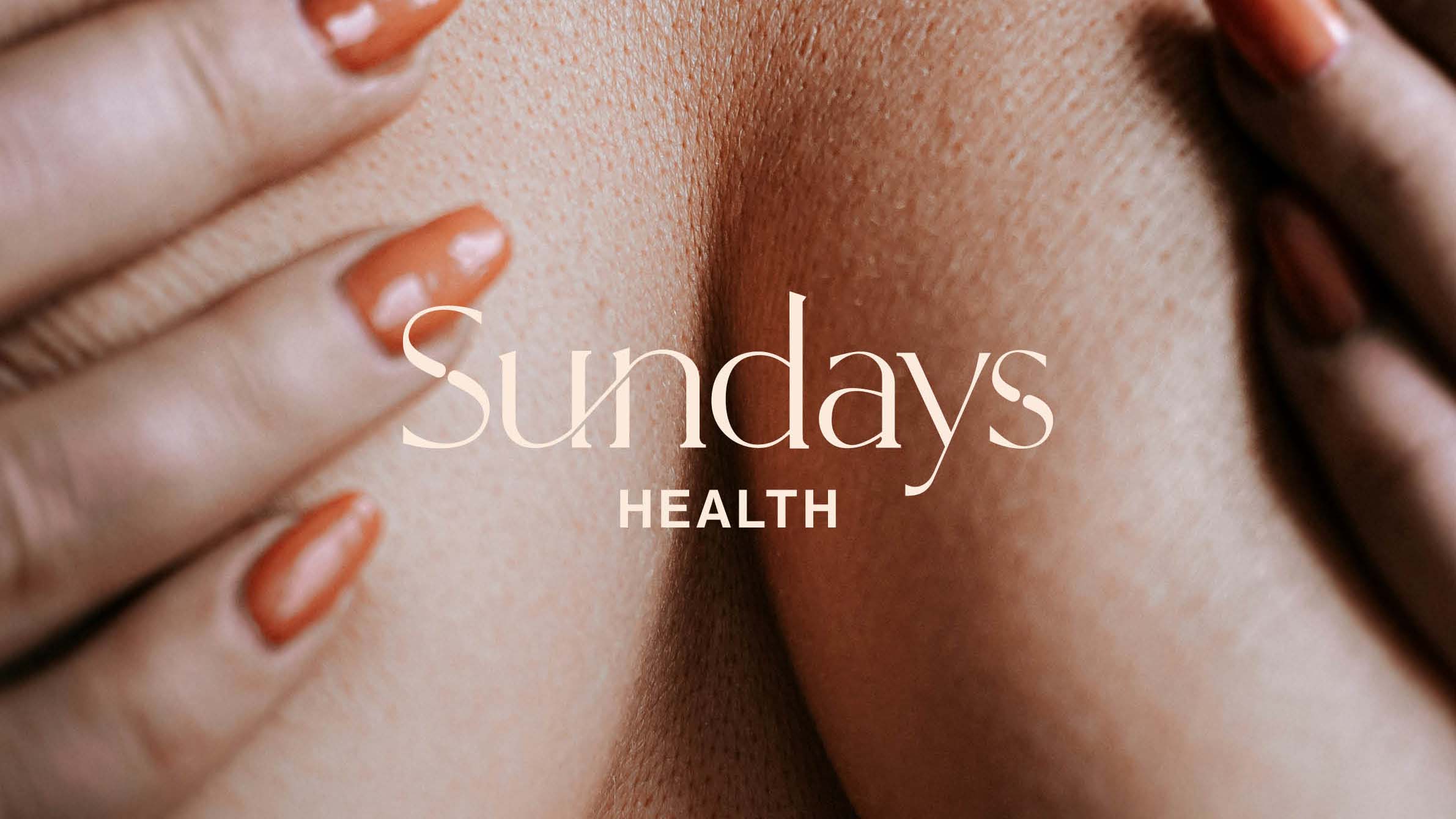
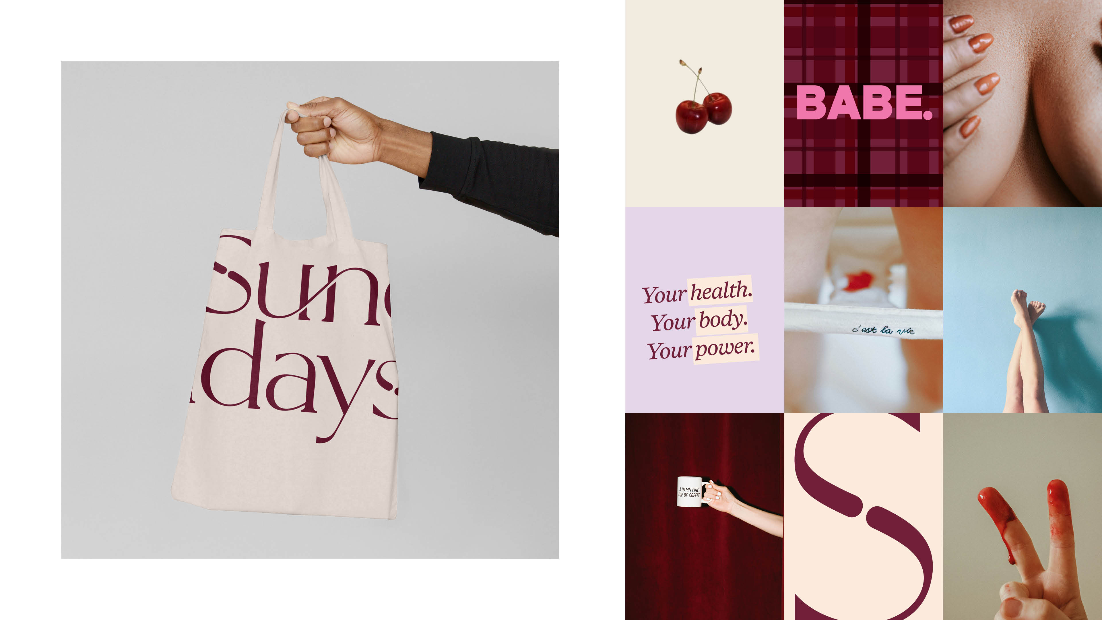
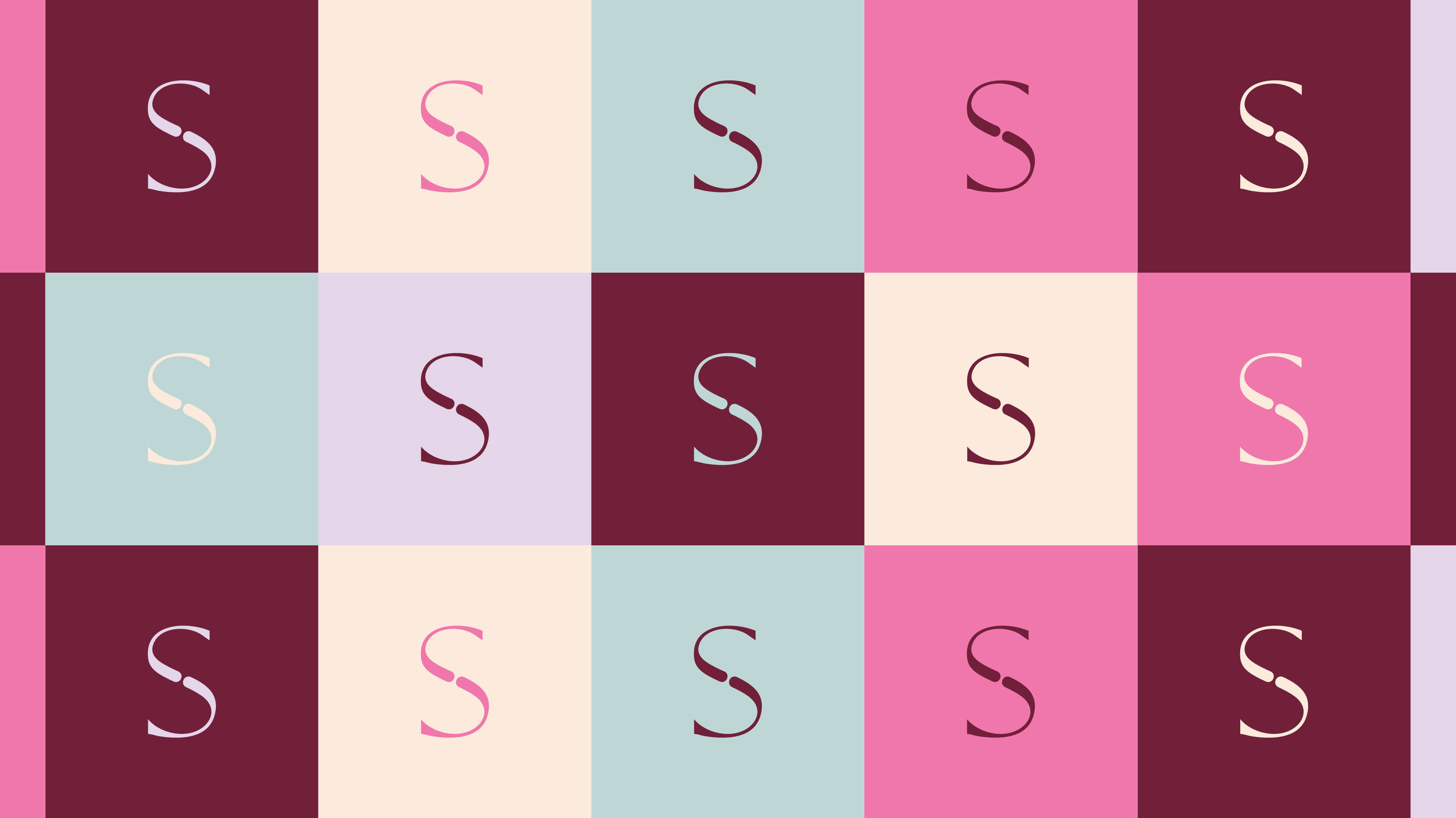
The visual identity balances confidence with approachability. We created a distinctive typographic wordmark with soft, character-filled letterforms that feel human and accessible. The identity plays with contrasts: bold, winding typography paired with clean sans-serif for clarity. A warm, unexpected color palette (rich plums, playful pastels, soft blues, and warm creams) adds energy without feeling clinical or overly feminine.
Photography became a key differentiator. Unfiltered, diverse, and confidently intimate, the imagery celebrates real bodies and female connection. We introduced graphic elements like gingham patterns and dotted borders to add personality and texture, reinforcing the approachable, slightly retro Sunday vibe.
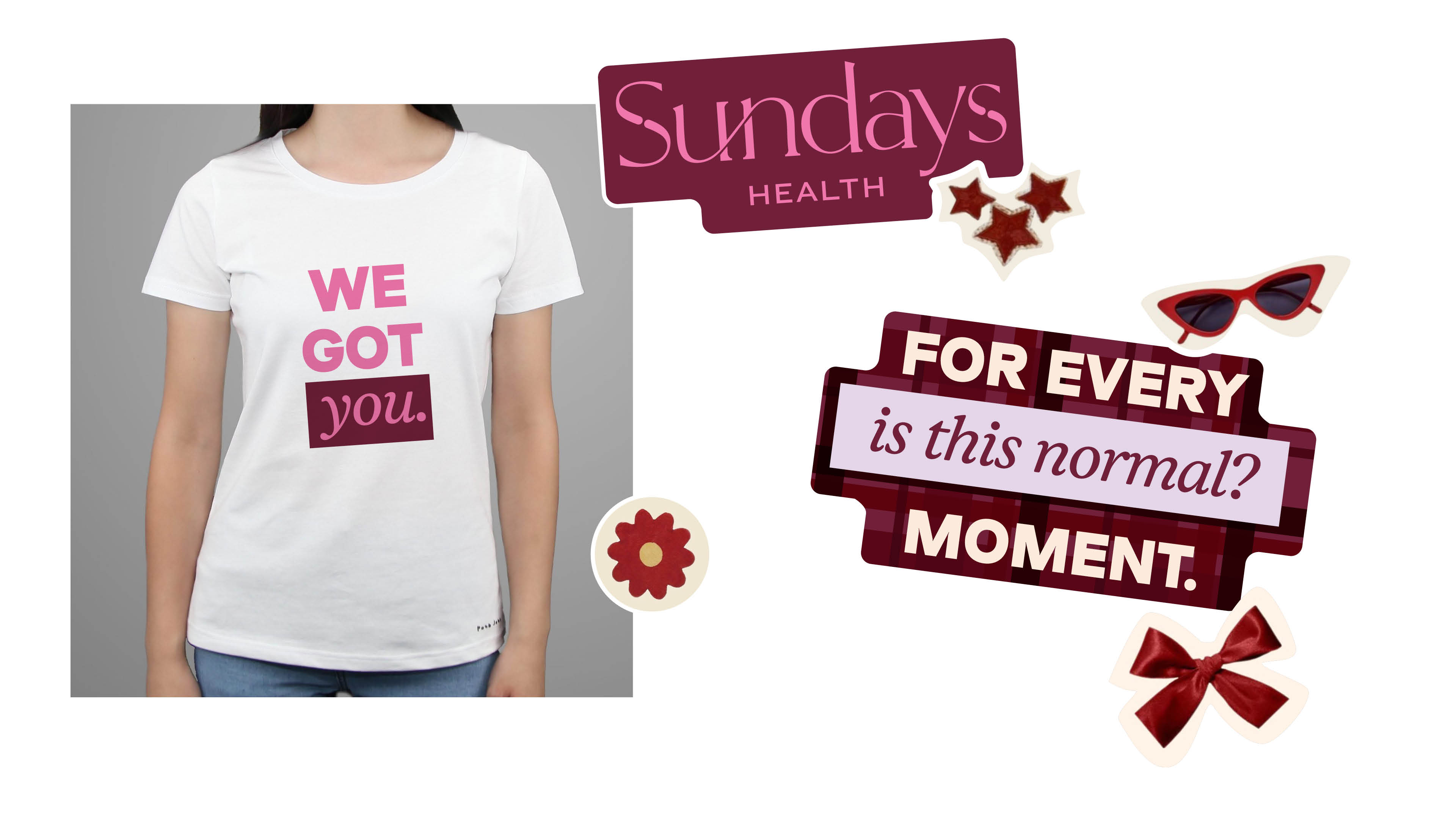
Sundays Health now has a brand that stands out in a crowded wellness space. The identity speaks directly to women navigating "big firsts" and "is this normal?" moments, offering them a trusted resource that feels more like a supportive community than a health platform. The visual system is flexible enough to work across digital content, social media, and future product applications, while maintaining the warmth and clarity that makes Sundays Health feel different. The brand doesn't just inform. It empowers women to lead the conversation about their own health.


"Launching Sundays Health has been a lifelong dream, so finding the right design partner was everything. I wanted to make sexual and reproductive health feel approachable and relatable, without sacrificing trust or credibility and Ocean Design delivered beyond anything I could have imagined.
Matt and the team elevated Sundays Health to an entirely new level across branding, UX, and UI. What amazed me most was their ability to take everything I had shared about the mission and ethos of the brand and translate it into a visual identity that felt completely true to the vision. When it came to the website, I told Matt I wanted to throw out the rulebook and push the boundaries of what a health education website could look like. That's exactly what they did. Working within a tight budget, they were super collaborative in finding creative solutions that kept costs down without cutting corners. Matt was an absolute legend to work with, honestly, there was no idea too big or too ambitious (trust me, I had a lot of them). He'd take it all on board, problem-solve and make it happen.
What started as a project has turned into an ongoing partnership, and we wouldn't have it any other way. If you're building something you really care about, these are the people you want in your corner!!" - Talani Newton, Founder


